Retailer Point-of-Sales
A modern POS system boosts sales and customer satisfaction by enabling efficient order creation, management, and delivery. Employers need it to empower their staff and cater to customers effectively.
The Goal
As a UX Designer, the goal of the IT team is to build a new POS system that merges order creation and management into a simple and effective ecosystem for all staff members to boost sales, reduce delivery errors and better manage online customer services.
The Results
After extensive collaboration with stakeholders and staff, The implementation of tablet and desktop platforms was signed off to the development team for location testing. The rollout of tablet order creation is scheduled to be released first before order management.

How can we modernize a point-of-sales system for all staff members and across multiple platforms?
The Challenge
Business Problem
The business is utilizing an outdated system with limited integration between members, staff and management. The development team is currently managing two separate systems, including paper processes—directly affecting how quickly sales orders can be created and managed.
Customer Problem
Staff's system requires extensive verification and paper procedures, causing user mistakes and inconsistent reporting to upper management. Floor staff use a different method for order creation compared to online and chat teams, requiring necessary changes for better cross-platform integration.

Research Approach
The product designer analyzed the current process to improve it by gathering user feedback with the help of a business analyst. The designer interviewed and shadowed staff members, observing daily order creation and management.
Stakeholder workshops where needed to further educate and understand the trade-offs needed to create a better work experience. The team workshops helped to acquire client approvals, obtain key insights and was critical to ensuring team cohesion and training for future stores.
Understanding the user base was needed in order to further define development and release strategy to minimize training, elevating the brand, and encourage data driven design that affects key performance indicators across the business.
Reworked Product Ecosystem
In order to better understand the ecosystem and integration between order creation and order management—the current system was reworked to view the overlaps between both systems. The goal was to identify and eliminate redundancies and promote simplification for long-term sustainability.

Redefining the user flow across platforms
In order to ground the research, a new order creation user flows were needed to help uncover areas with opportunity and encourage consolidation around redundant processes. Order creation was the primary focus as it directly affects the staff and customer experience in the most impactful way. The next step was to identify which users are mostly effected and how much training will be needed for initial release.
Demographic Exploration
-
Floor staff members are on the front lines when interacting with customers on a daily basis. They handle the majority of the orders and greatly impact the customer and brand experience.
-
Customers also make orders online and through the website before coming into the store. The order process is different considering they use a desktop platform instead of a tablet experience.
-
Back orders and order adjustments tend to happen quite frequently. Making a complicated order simple and easy would be highly valued.
Three Archetypes for Better Cohesion
For a smoother process online and on the floor, three key archetypes were created to ensure a similar experience between in-person and online as well as between portrait and desktop experiences. The experience is meant to influence all of order creation as well as upper management and online orders.
Research Insights
Simplification & Consolidation
Working across multiple platforms and online websites is time consuming and inefficient. Any form of simplification and consolidation was needed to reduce order errors and better allocate between different teams and departments.
Encouraging Digital Processes
Processes that continue to use paper for verification and confirmations is often overlooked if it’s not properly integrated into the workflow. A large potion of the checkout process was digitized in order to reduce staff errors in the future.
Modernization & Brand Cohesion
The current system was initially build solely on functionality over brand unity and elegance. The look and feel of the current website was used as a baseline for building brand continuity and ensuring familiarity across departments and staff members.
Reducing Redundancies
Working tangentially with simplification—the need to overcompensate for user errors left many processes similar and redundant in manner. Building a unified system would help eliminate errors and help management solve issues more efficiently.
Research Analysis & Direction
The product designer worked closely with business analyst and developers to understand how to prioritize changes while only focusing on the ideas that will fall into the first iteration for UAT testing. Considering the importance of order creation and feasible development—the team decided to separate order creation and order management into two phases. The larger management phase will be implemented strategically into smaller sprints releases.


Raising the Bar on Brand Quality & Aesthetics
Inspired by brand quality already preset on the website, the client wished to replicate the product search to mimic the experience found on the company website. In order to do so, the development team needed additional development time while encouraging the staff to used a more generic search in addition to the website for product search. Proper customer order and product search integration would be part of a later release following extensive testing.
Desktop & Tablet Integration
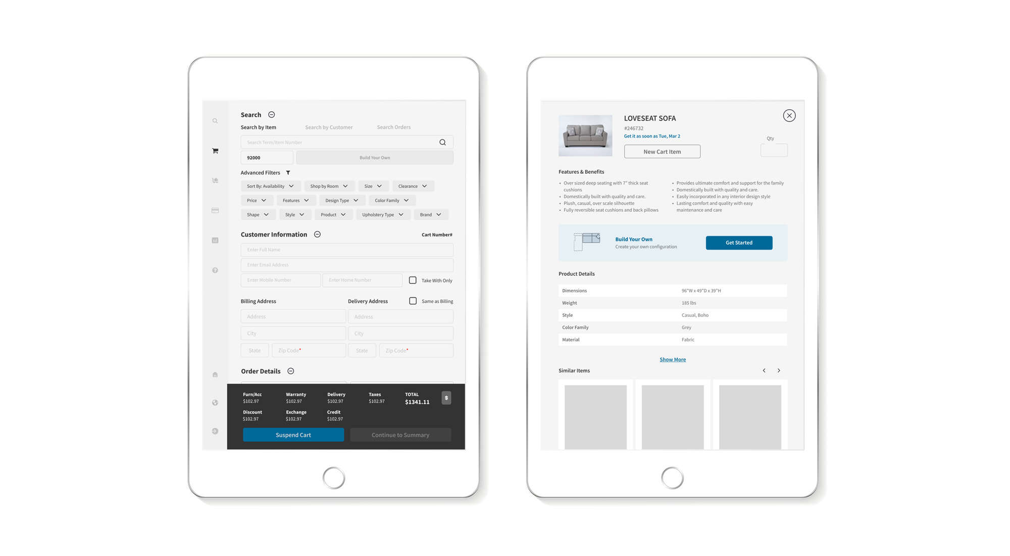
As in initial step for a unified system, the development team focused on creating a responsive design that allows staff members to shift between portrait and desktop and cross departments with ease. The user flow remains the same with only minor changes and differences between the two layouts for easier training and staff adoption. Additional worker training will be needed to accompany product release.
Additions to Universal Search
In addition to creating a universal search that leads to both order creation and management, these additional features were included for a better overall experience:
Dedicated filters for specific search
New tab experience to move between orders
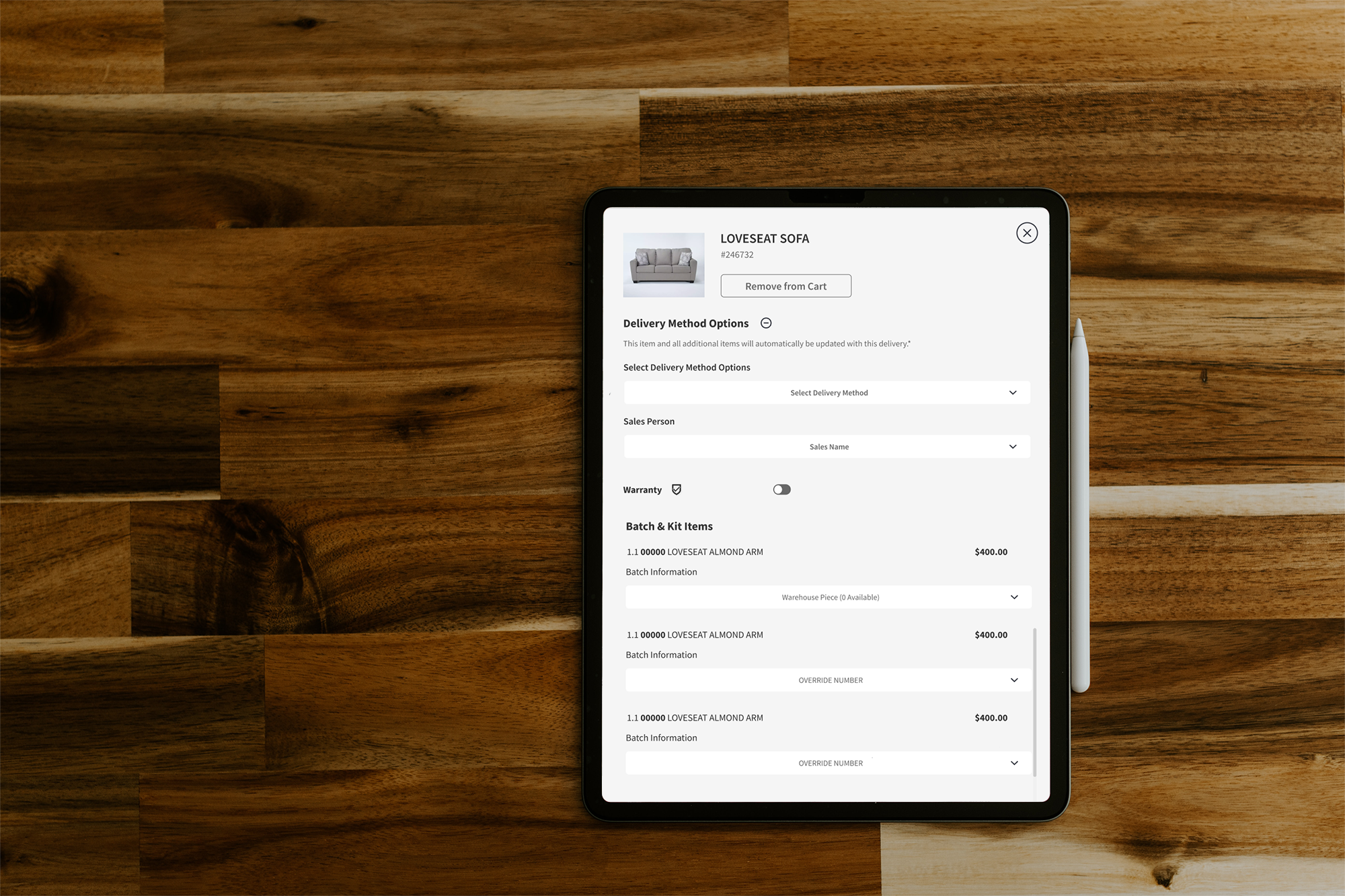
Selecting multiple items for delivery
Standardizing icons for cart indicators
New Product Details & Check-out experience

Project Retrospective
Business Goals
The key goal is to help the business set up a new baseline for an integrated system that is both intuitive and more efficient during all steps of customer engagement. Client workshops and UAT testing will be an important factor to consider in the following rounds of iterations for the development and e-commerce team. Testing will first focus on certain locations and stores in order to fix the necessary problems before a major release across the country.
Ongoing Challenges
Working closely with a client without prior knowledge on UX has made the workshop meetings an essential step in getting client approvals and moving the design forward. Key members of the team were not always available for review and ultimately created a few situations that required working backwards toward previous design iteration where important decisions have already been made and approved. The team engagement with figma and other design files made it difficult to collect user feedback in a timely manner.
What’s Next?
With the creation of a design backlog for future releases, an agreement was made to focus on specific sizes, locations, and users most directly affecting customer engagement. Order creation would first be tested on portrait and desktop before the development of order management. Order management would primarily start with desktop before fully integrating into portrait for access on tablet. Executive managers will finally have the ability to make order adjustments on a tablet—which has never been put into development until now.
Testing will primarily be location and store based for real-time feedback before expanding to other stores across the business.


